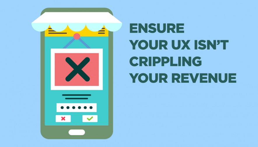
These 7 UX Mistakes Could Be Killing Your Ecommerce Conversions

UX mistakes come in all shapes and sizes, and even a seemingly normal design element could be a glaring issue to a customer on your site. I’m sure you can recall a time that you were browsing for a local store on your phone and wished there was a click to call integration. Or, encountered an “add to cart” button that was so small you could barely tap it with your finger.
Problems like those are still common today, and they’re having a pretty severe impact on conversions – especially on mobile devices. On average, there’s a near 50% drop in add-to-cart activity from desktop (8%) to mobile (4.8%).
If you want to keep conversions and gain that revenue, you need to take a close look at the user experience (UX) on your site to ensure you’re not inadvertently killing your conversions. Here are 7 of the most common UX mistakes you might be making.