Why are Email Pop-ups Effective?

A large part of what makes email pop-ups effective is their use of a technique called “pattern interrupt”. Anything that changes a person’s behaviour or thought in an instant can be considered as a pattern interrupt.

It is an important ingredient in funny jokes, viral YouTube videos, and cold calls that sell. It’s something you say or do that makes another person abruptly pause, think, and reconsider.

Simply put, email entry pop-ups are effective because they are great at instantly affecting someone’s thoughts and behaviour.

However, the same reasons why they are effective can also make people perceive them as annoying and intrusive. Email pop-ups can be tricky to implement, but when done right, they can do wonders for your marketing campaign.

Elements of Email Pop-ups that Work

If you want your email pop-up to rake in subscribers, it has to have the following elements:

  • Attention-grabbing design
  • Creative, fun language
  • Irresistible offer
  • Right triggers
  • Sense of Urgency
  • Compelling call-to-action
  • No spam pledge
  • Clickshaming

Let’s talk about each of them in a bit more detail.

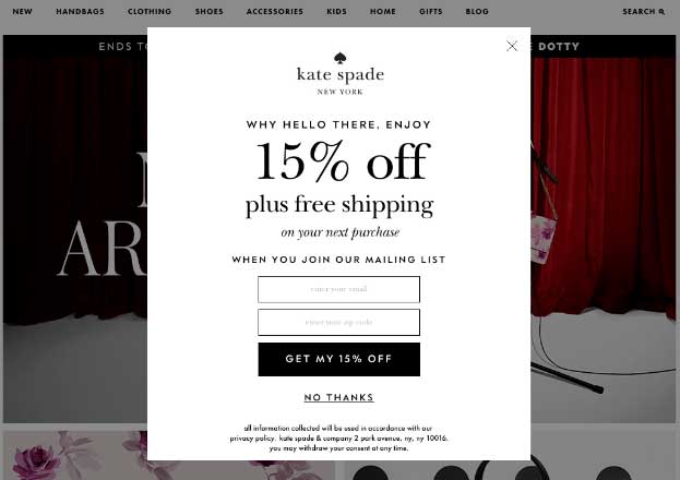
1. Attention-Grabbing Design

Your pop-up should stand out and not blend into the background, otherwise a site visitor will automatically ignore it and you fail to harvest the email address. Worse, they may think that something is wrong with your site, forcing them to bounce off your page.

Grey out the rest of the page to make the pop-up the centre of attention, and use strong imagery and interesting colours. Or you can go for a minimalist look, and wow them with effective use of white space and typography.
2. Creative and Fun Language

Visitors to a dog website will better appreciate an email pop-up that says “Join the pack” and “Get started and pupscribe” rather than something generic like “Subscribe to our mailing list”. The site visitor is interested in dogs, and is conceivably already familiar with canine jargon and puns, and will appreciate words that resonate with their love for these animals.
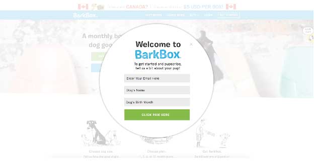
Use of humour can be powerful. Fun language in your pop-up will give the impression that emails you send subscribers will also be fun and enjoyable to read.

3. Irresistible Offer

If you have an e-commerce website, you should know that the most compelling offer you can make is a great discount, a free item, or free shipping. Who doesn’t want to save money or receive freebies?
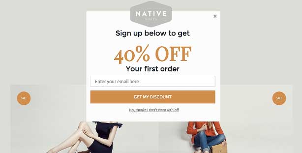


Another incentive that works well is to offer the chance to win prizes in sweepstakes or contests. You can also entice subscribers by promising them advanced previews of new products or exclusive offers and discounts. These promises are not as appealing though, since they do not provide instant gratification.

4. Right triggers

Should your email pop-up appear immediately, or after your visitor has spent some time on your page? The trigger for the pop-up should be timed right, for maximum email harvesting potential.

If the pop-up is the first thing that your reader has to deal with, avoid making it overwhelming. Make sure the close button is easy to find. If not, your visitor will find it easier to just close the browser tab entirely.

Popular nowadays are exit intent email pop-ups. These track the movements of a user, so the pop-up only gets displayed when they show signs of leaving your page, such as moving the mouse towards the close tab button.


5. Sense of Scarcity and Urgency

Give your users a persuasive reason to act now, and chances are, they will. For example, you can make discount offer for a specific item available for only 12 hours, or your free shipping code valid only on the weekend before Mother’s day.

Or let the user know that you are giving the offer to only a selected number of people. Make users feel that they will miss out on something big if they don’t sign up and do it right now.

6. Compelling Call-to-Action

The CTA (call-to-action) button has to be value-driven. To make someone click that button to submit their email address, they need to have a clear idea of what’s waiting for them on the other side.

As a matter of fact, you should avoid using the word “Submit” or “Subscribe” in your CTA button. It makes the user feel that they’re the one giving you something, when you should make them see what benefit they will get instead.
7. No Spam Pledge

It’s good practice to remind would-be subscribers that you respect their privacy, and that you’ll never send them SPAM. They need to know that you’re not going to sell, distribute, or use their email addresses for anything other than giving what they signed up for.

8. Clickshaming

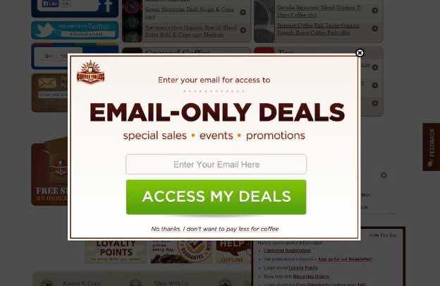
Examples of click-shaming include “No thanks, I don’t like discounts” or “No, I don’t like to change my life” and “No, I want to look unprofessional”. Clickshaming uses a negative link that incites people to think that opting out makes you terrible at life.

So you can imagine why this tactic won’t work with everybody. It comes off as rude, passive-aggressive, and even offensive. You may want to tone down the shaming, and make sure you do A/B testing to see if this gets you successful sign-ups.

Optimize Your Targeting

So you have designed an email entry pop-up and are ready to deploy it. There are a few things you need to consider so that your visitors, both new ones and existing subscribers, will be targeted correctly. After all, your opt-in form is meant to harvest new email addresses, and not annoy your returning customers.

For optimum performance, your email pop-up should apply to new visitors only, and should only ever show a few times (max. 3). You should also make it a point to exclude those who visit via email referral.

It’s also best to display the pop-up after at least 10 seconds of active visitor interaction. If the visitor is passive, then make use of an exit intent trigger.

Conclusion

The importance of your email list cannot be underestimated. Ramsay Taplin, the founder of Blog Tyrant, said that “Even if all of my search rankings disappeared tomorrow I’d still be able to promote my blog to tens of thousands of people via email.”

Therefore growing your email subscribers needs to be on your priority list. And one of the most effective methods to capture email addresses is with the use of email entry pop-ups.

But not all email pop-ups are created equal. So when creating one, consider the vital elements outlined above, and you’ll be on the right track.

Reasons Your Facebook Ads Aren’t Connecting with Consumers

When orchestrated properly, Facebook ads will stop readers in their tracks, entice them to click through to your landing page and ultimately, drive conversions. Chronext, a digital marketplace for luxury watches, experienced a 40% boost in traffic and 14x return on investment thanks to a carefully executed ad campaign.

However, if you’re not careful, Facebook ads can quickly become a money pit as General Motors found out. Spending money on Facebook ads will guarantee you a certain level of reach, but if your ads don’t actually connect with your customers or result in financial remuneration, then what’s the point?

In the Age of Information, where people are less responsive to advertising than ever before, creating generic ads for untargeted audiences is not effective. In order to cut through the noise and connect with people, you need to create ads that are highly personalized.

Fortunately, Facebook is the perfect platform to do this. If your ads aren’t connecting with your ideal consumers, it’s likely that you’re making one (or more) of the following mistakes.

What Most Companies Get Wrong with Paid Facebook Ads

Facebook advertising represents a fantastic opportunity for marketers. In September 2016, the total number of Facebook advertisers had reached 4 million — this figure was 3 million only six months before!
Facebook’s Chief Operating Officer, Sheryl Sandberg, attributes this growth to the continued mass adoption of mobile internet access across the world. Mobile advertising made up 84% of the company’s total sales in the second quarter of 2016.

Despite the fact that marketers are flocking to Facebook to launch new campaigns every day, not every campaign is successful (as General Motors found out several years ago). As with any advertising medium, there are nuances to observe and pitfalls to avoid.

Let’s review the most common mistakes I’ve seen companies make when it comes to paid Facebook ads. It’s much better to learn from someone else’s mistakes than make them yourself!

Is Your Ecommerce Website Ready for International Sales?

Ecommerce sales are ramping up in the United States, with consumers doing more than half of their shopping online, according to ComScore and UPS. But the U.S. isn’t the only country seeing explosive growth in online sales; research from eMarketer predict’s that global ecommerce sales will hit $1.9 trillion this year, with double-digit growth nearing $4 trillion by 2020.

Your online store gives you the ability to sell to every corner of the world where prospective customers have access to the web. However, many online merchants continue to shrug off this opportunity due to the logistics of cross-border fulfillment.

There are numerous advantages, and a bigger slice of revenue just waiting for you, if you’re willing to pivot and make some changes to your ecommerce strategy.

These 7 UX Mistakes Could Be Killing Your Ecommerce Conversions

UX mistakes come in all shapes and sizes, and even a seemingly normal design element could be a glaring issue to a customer on your site. I’m sure you can recall a time that you were browsing for a local store on your phone and wished there was a click to call integration. Or, encountered an “add to cart” button that was so small you could barely tap it with your finger.

Problems like those are still common today, and they’re having a pretty severe impact on conversions – especially on mobile devices. On average, there’s a near 50% drop in add-to-cart activity from desktop (8%) to mobile (4.8%).

If you want to keep conversions and gain that revenue, you need to take a close look at the user experience (UX) on your site to ensure you’re not inadvertently killing your conversions. Here are 7 of the most common UX mistakes you might be making.

Do You Have a Product… Or a Business?

Releasing an ebook or selling a service is a great achievement. But a lot of digital entrepreneurs believe that’s all there is to being in business.

Having a business means more than having a single product. It means committing to continuous sales funnel development, and to being thoroughly invested in the success of your consumers over the long haul.

Yes, the risks are huge. The rewards, however, are even greater.

If you don’t have a business – if all you have is a single product – you’re putting your financial future in jeopardy. What will happen if, all of a sudden, demand dries up for your product?

Maybe you’ve saturated your market, or maybe changes in your industry make your product obsolete, but if you’ve staked your claim on a single product, you could lose it all in a day. On the other hand, a fully-fledged business means that, even if interest in one of your products disappears, you’ve still got a stable of great offerings and a diverse group of customers to buy them.

Below, I’ll help you determine if you have a product or a business. If you have a product, I’ll talk about the key steps you need to take in order to change your thinking from a salesperson of a product to an entrepreneur in business.

We’ll also touch on what you can do if you want to function like a business, but don’t want to jump in head first just yet.

5 Steps to Launching a Profitable Google Shopping Ads Campaign

With the holidays just around the corner, now is the best time to expand your product advertising in e-commerce, which includes Google Shopping campaigns. According to RKG’s Digital Marketing Report, these types of product listing ads consistently demonstrate improved conversion rates over other forms of ads, such as text ads in search.

Unfortunately, as the popularity of Google Shopping ads increases, so do costs per click. That means you’ll need to focus more on the setup and optimization of your campaigns to ensure they remain profitable while still targeting the right audience. Although product listing ads lack the option of traditional keyword targeting, they can still be optimized to help you maximize your ad campaign’s performance.

In this post, I’ll show you the five best ways to ramp up your returns in Google Shopping ad campaigns.

10 Ways to Reduce Cart Abandonment and Re-Capture Customers

You and I have never actually met, and I’ve never seen your e-commerce store, but I guarantee you’re losing money. Every day, a number of people who visit your online store abandon their carts before completing their purchase.

Want to know how many people are leaving?

The average abandonment rate is 68%, based on data compiled from 33 different studies on shopping cart abandonment.

That means for every 100 visitors to your store, 68 of them walk away.

Thinking Ahead: Is Your Ecommerce Business Ready for Cyber Monday 2016?

More consumers are shopping online than ever before. According to one study from UPS and comScore, consumers now do more than 50% of their shopping online. You can expect this figure to spike during the holiday shopping season, and you can reap the rewards of this boost in online consumer traffic if you start preparing your online store for Black Friday and Cyber Monday right now, instead of waiting until the last-minute.

This article presents a solid 10-point checklist of the most critical items to address while preparing your e-commerce store for the holiday crowds.

8 Great Corporate Snapchats to Follow

You probably fall into one of two camps. You might believe Snapchat is a fad, silly memes and lusty Lotharios looking to send a few risqu? photos to their special someone. (You are wrong, by the way.) Or you believe it to be the second most powerful social media platform in the U.S. behind only Facebook. Ding, ding! You’re right!

Launched in 2011, Snapchat has experienced unparalleled growth in just five years, reaching milestones faster than, well, everybody. Just how important is Snapchat to marketing in 2016? Very. Take a look at these stats: